
The Magazine
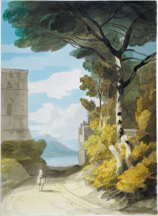
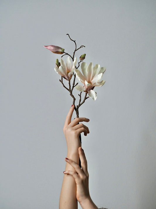
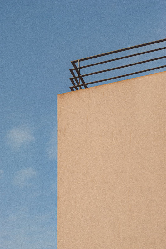
The Power of Color: The Impact of Color in Fine Art Photography
When it comes to photography, color plays a fundamental role in evoking emotions and capturing the essence of a subject. In the realm of fine art photography, the impact of color becomes even more pronounced, as it not only conveys a visual message but also serves as a powerful storytelling tool. Understanding the significance of color in fine art photography can enhance your appreciation of this art form and help you create more meaningful and visually captivating images. Let's dive into the fascinating world of color in fine art photography.
Color Psychology and Emotion
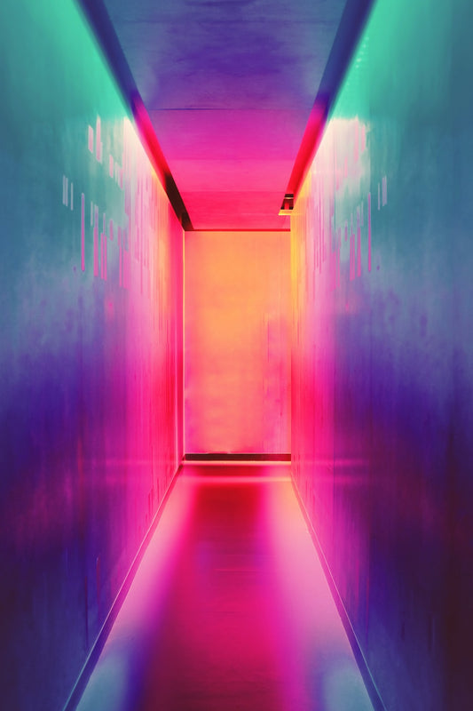
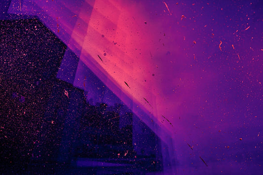
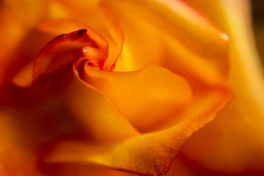
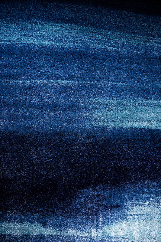
Color has an incredible ability to evoke emotions and influence the way we perceive the world around us. In fine art photography, the thoughtful use of color can elicit specific emotional responses from viewers. For example, warm hues like reds, oranges, and yellows often evoke feelings of warmth, passion, and energy. On the other hand, cool tones such as blues and greens can create a sense of calmness, serenity, and tranquility.
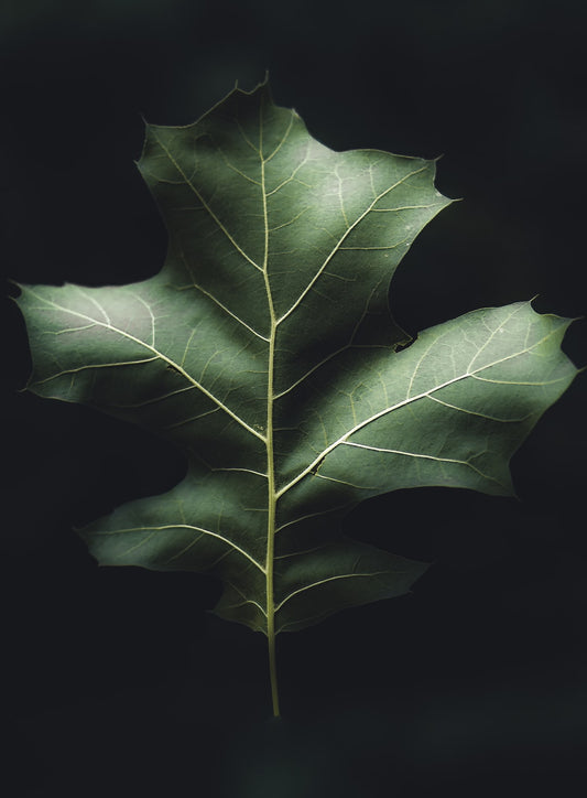
Furthermore, each individual color carries its own symbolic meaning. Red is often associated with passion, love, and intensity. Green signifies growth, renewal, and nature. Blue is frequently connected to depth, stability, and loyalty. Incorporating these symbolic meanings into your fine art photographs through the use of color can help convey a deeper message.
Setting the Mood
Color also plays a significant role in setting the mood and atmosphere of a photograph. By carefully selecting the color palette, photographers can create a distinct ambiance that resonates with the subject matter. For example, a photograph dominated by warm and vibrant tones can evoke a sense of excitement and energy, while a cooler palette may imbue a photograph with a sense of tranquility and introspection.
Consider the way color is used in well-known fine art photographs. Vincent van Gogh's "Starry Night" features a harmonious blend of rich blues and yellows, creating a dreamlike and ethereal atmosphere. The warm, golden hues in Gustav Klimt's "The Kiss" evoke feelings of passion and romance. These examples demonstrate how color choices can enhance the emotional impact of a photograph.
Contrast and Composition
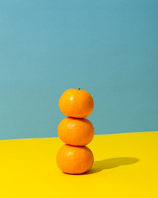
Color contrast is a powerful compositional tool in photography that can emphasize specific elements and create visual interest. Bold contrasts, such as pairing complementary colors, can make a subject stand out and grab the viewer's attention. Alternatively, using analogous colors (colors that are adjacent on the color wheel) can create a more harmonious and soothing composition.
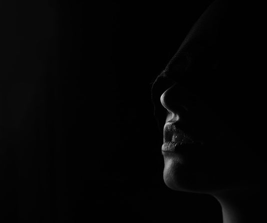
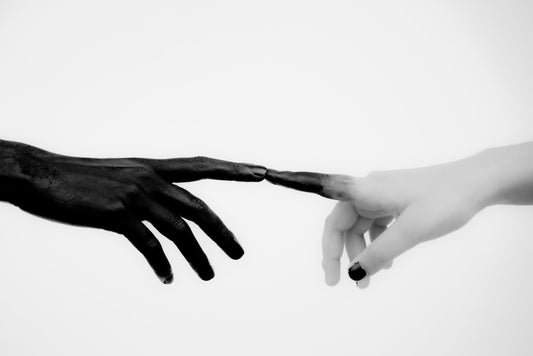
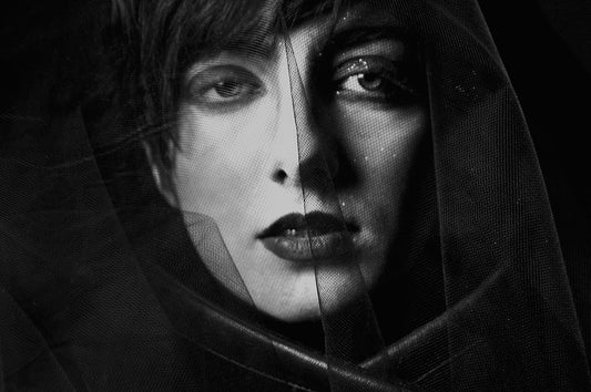
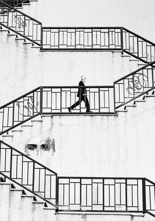
Contrast is particularly effective in black and white fine art photography, where shades of gray replace color. In this case, the contrast between light and dark tones becomes paramount. High contrast images can have a dramatic impact, while low contrast images have a softer and more subtle feel.
Color as Symbolism
Beyond its emotional and aesthetic qualities, color can also hold symbolic meanings that lend depth and symbolism to fine art photographs. By incorporating symbolic colors or color associations, photographers can add layers of meaning to their images.
For example, the color white often symbolizes purity, innocence, and spirituality. By using a predominantly white color palette, a photographer can evoke a sense of serenity or convey a spiritual message. The use of red, associated with passion and vitality, can add a sense of intensity to an image, while blue can evoke feelings of calmness and introspection, making it ideal for conveying a sense of solitude or contemplation.
Color in Subject Portrayal
Color in fine art photography can not only impact the mood and atmosphere but also influence how the subject is portrayed. Selecting an appropriate color scheme can enhance the subject's attributes or create certain visual effects.
For instance, warm tones can accentuate the warmth and intensity of a portrait subject, while cool tones can give a sense of distance or detachment. The color of clothing or props can also be used strategically to create harmonious or contrasting elements within the composition.
Creating a Personal Style
Exploring the use of color in fine art photography allows photographers to develop their personal style and signature. By consciously experimenting with different color schemes and exploring how they resonate with their subjects, photographers can create a cohesive body of work that is recognizable and unique.
Consider the distinct color palettes employed by fine art photographers such as Steve McCurry, who often features vibrant and warm colors in his photographs, or Saul Leiter, known for his use of muted and painterly tones. These photographers have developed a distinct visual language through their deliberate use of color, which contributes to their iconic status.
The Versatility of Monochrome
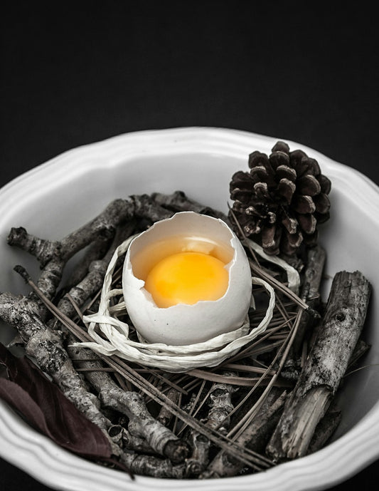
While color can hold tremendous power in fine art photography, it's important not to overlook the versatility and impact of monochrome images. Black and white photography allows us to focus on the interplay between light and shadow, shapes, and textures.
Monochrome images have a timeless quality and can evoke a sense of nostalgia or evoke a classic aesthetic. By removing color distractions, black and white fine art photography can emphasize the essence of the subject and evoke a mood that is uniquely powerful.
Using Color Mindfully
When embracing color in your fine art photography, it's essential to do so mindfully. Consider the impact of color on the emotions and perceptions of your audience. Ask yourself how your color choices contribute to the overall message and intent of your photograph.
Additionally, pay attention to the technical aspects of color in photography. Monitor color balance, saturation, and contrast, ensuring that they align with your creative vision. The mastery of color management techniques can greatly enhance the impact of your fine art photographs.
In Conclusion
Color is a potent tool in the realm of fine art photography. It has the power to evoke emotions, set moods, enhance composition, convey symbolism, and create a personal style. Understanding and harnessing the impact of color in your fine art photography will allow you to create captivating and meaningful images that resonate with your audience.
As you explore the world of color in your fine art photography, remember to consider the emotional and symbolic associations colors carry. Pay attention to how color choices affect the mood and atmosphere of your photographs. Use contrast wisely, and experiment with monochrome to emphasize the essence of your subjects.
Let color be your ally in storytelling and expression, and watch as your fine art photography takes on new depths and resonates with viewers on a profound level.
Unveiling the Mysteries of Fine Art Photography Prints

The Captivating Influence of Fine Art Photography on Modern Art
Exploring Fine Art Digital Photography: A Journey Through the Artistic Lens

The Art of Composition: Elevating Your Fine Art Photography
The Beauty of Breaking the Rules in Fine Art Photography
The Connection between Fine Art Photography and Emotion
Uncovering the Captivating Journey of Fine Art Photography
The Power of Fine Art Photography: Elevating Interior Design
Unveiling the Magic: Discovering Fine Art Photography Exhibitions
The Power of Negative Space: How Fine Art Photography Embraces Simplicity
Exploring the World of Fine Art Photography Movements
Finding Inspiration for Fine Art Photography

The Art of Still Life Photography in Fine Art
The Art of Still Life Photography in Fine Art
How to Add Life to Your Fine Art Photography with Texture
The Beauty of Fine Art Portrait Photography
Exploring the Artistry of Fine Landscape Photography
The Power of Color: The Impact of Color in Fine Art Photography
Unveiling the Secrets of Fine Art Black and White Photography
Mastering the Art of Composition: Creating Powerful Fine Art Photography
Unlocking the Magic of Abstract Fine Art Photography
The Dance of Light: Exploring the Role of Light in Fine Art Photography
Unveiling the Beauty: Exploring the Various Styles of Fine Art Photography
Unlocking the Secrets: Understanding the Techniques in Fine Art Photography
Capturing Emotions through Fine Art Photography

The Art of Capturing Time: The Evolution of Fine Art Photography
Discovering the Artistic Marvels of Fine Art Photography
The Art of Capturing Candid Moments in Documentary Photography
Tips for Creating Fine Art Photographs with a Vintage Feel
The Magic Behind Fine Art Photography: The Power of Storytelling
No comments
0 comments